Uilliu

Luxury Meets Spice.
Uilliu was a spice company selling high-end products. Our client envisioned a sophisticated take on food, inspired by fashion. They reached out to Third Analytics to design their logo and packaging. We researched classic & high-end fashion houses, other spice brands, and consumer packaging trends to develop this brand. The challenge was ensuring that the brand remained true to the client’s wishes (fashion-inspired) while still looking like a food brand. In addition, the client wanted the product to reach a wide range of ages, so the design had to appeal to that too.
Logo Design
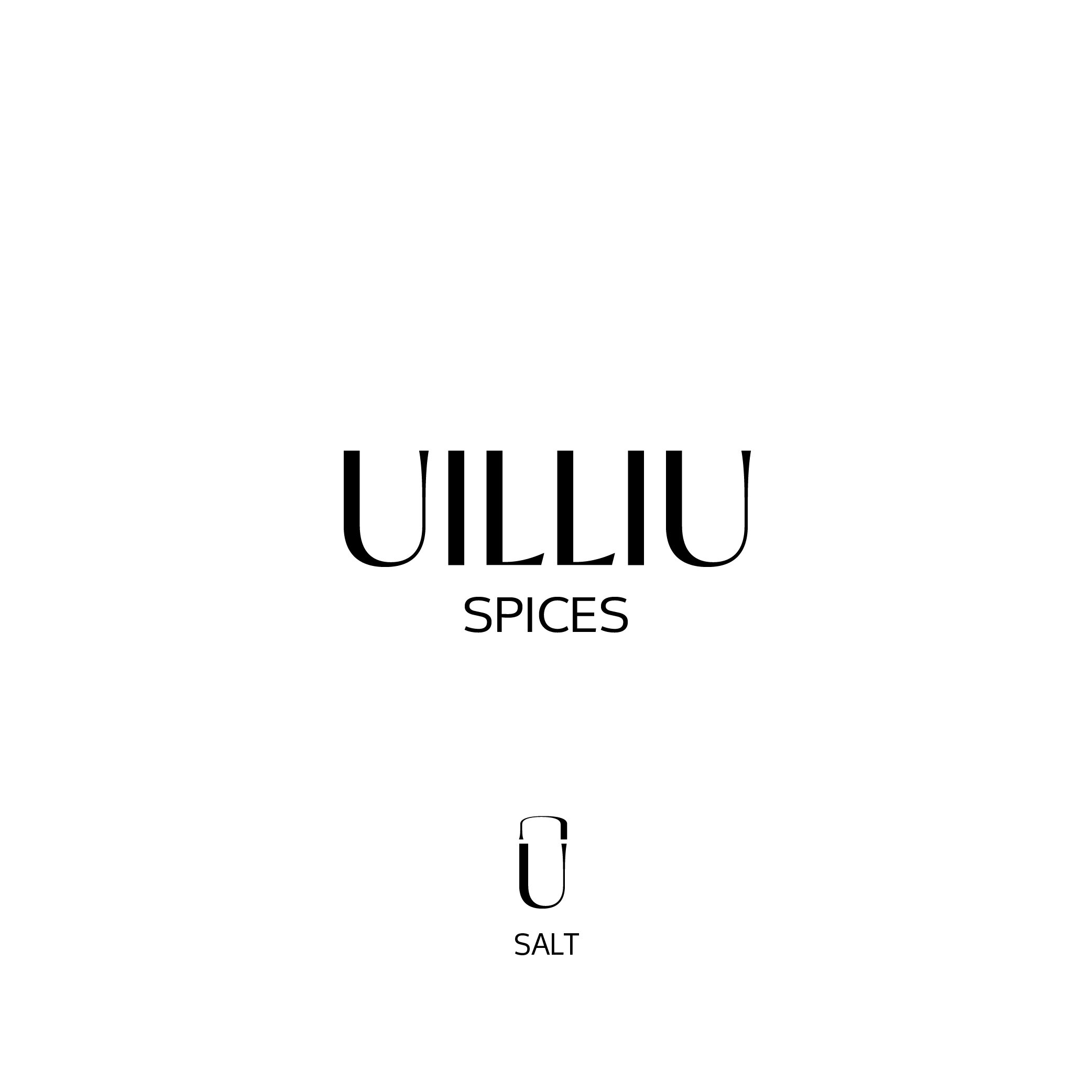
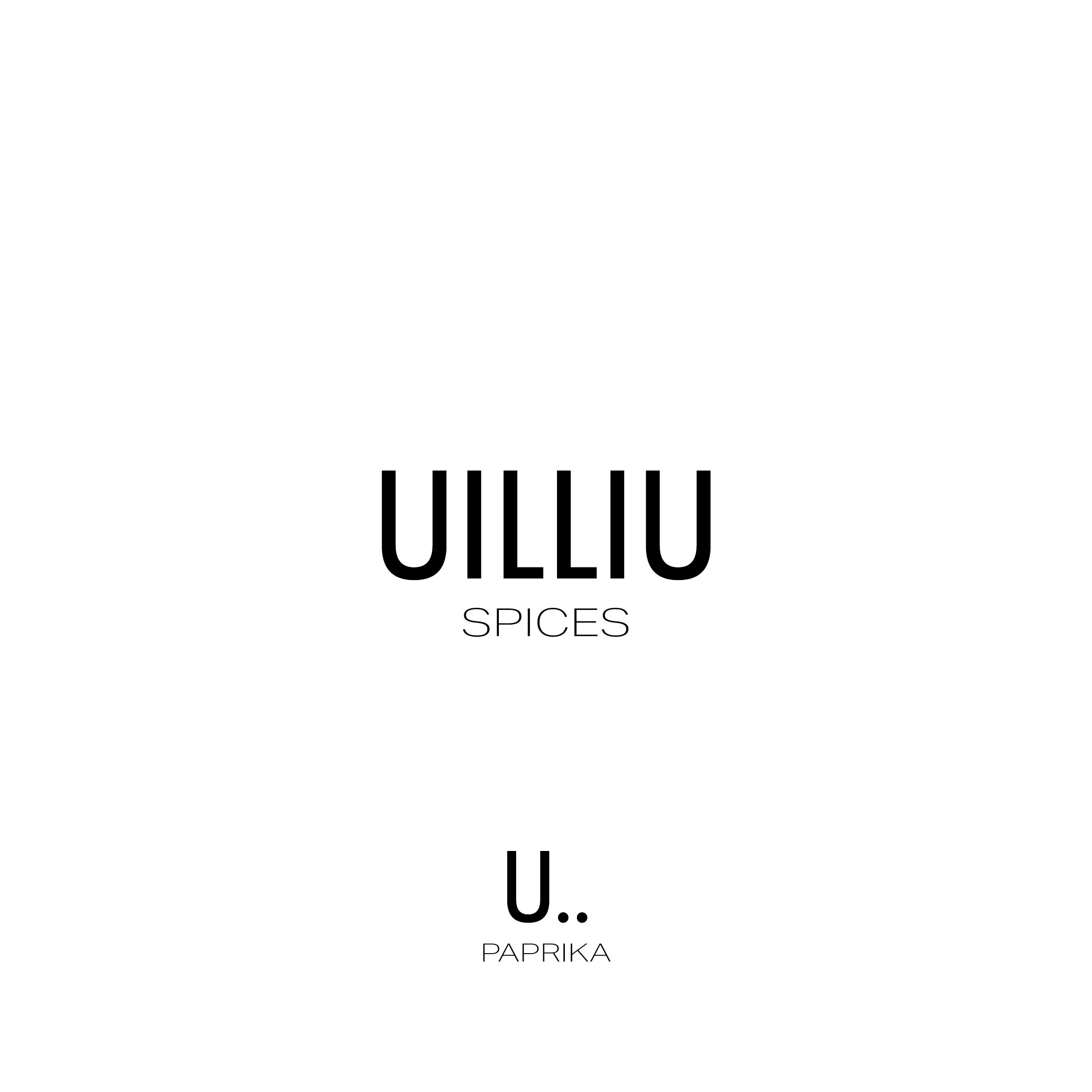
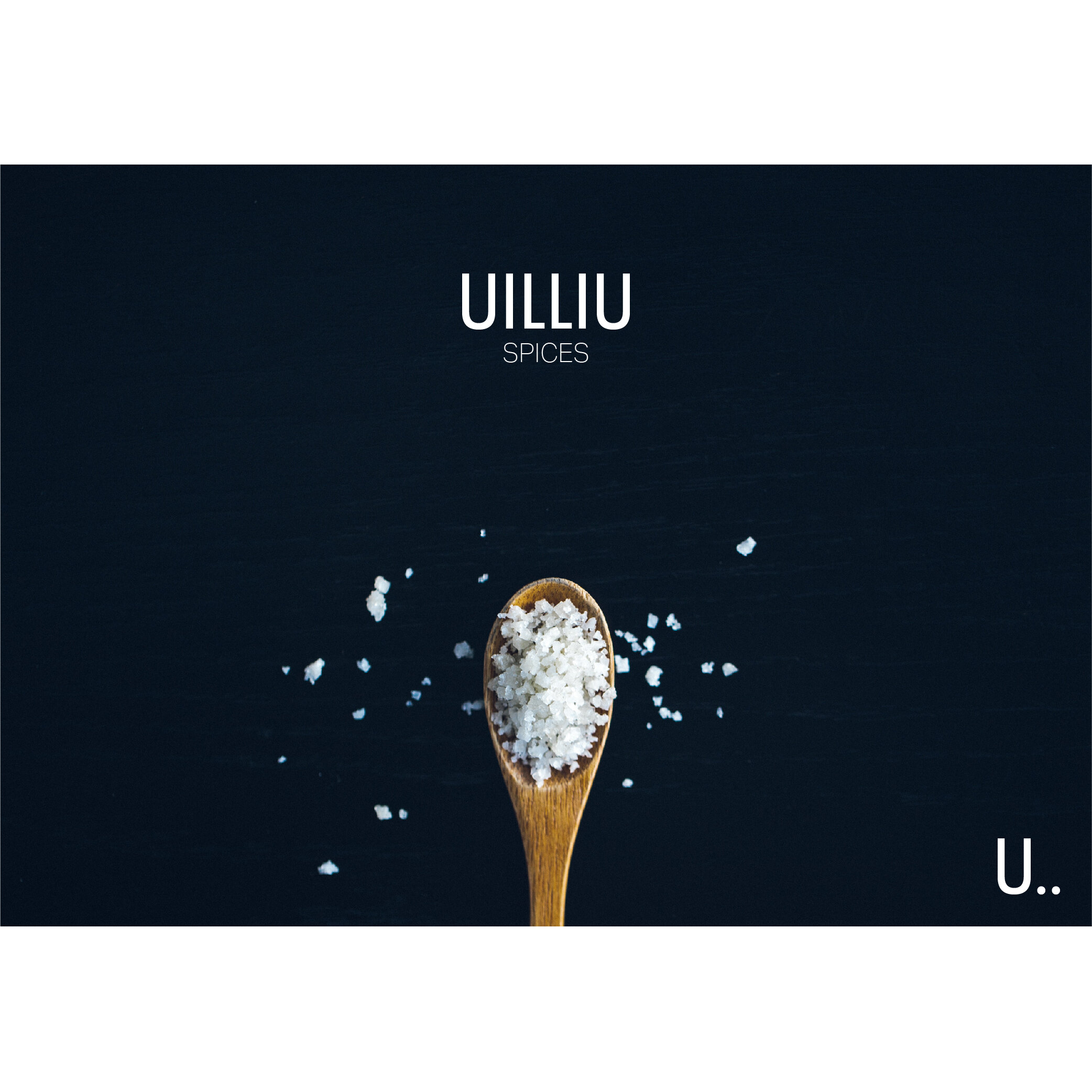
We designed two logo concepts for our client, and the client ultimately chose the concept on the right. We took inspiration from major fashion houses, but we took two different directions with it while staying true to our client’s needs. The concept on the left is based on a unique sans-serif typeface that gives a retro-modern feel. We particularly liked the distinctive U, especially in its resemblance to a container; we used it to construct the logomark. The concept on the right takes a more modern approach, with a more minimal sans-serif typeface. The “U..” is a more abstract representation of a container and its spice contents. In both concepts, we paired the name of the company, “Uilliu”, with “spices, in a manner similar to how fashion houses pair their names with cities.
The two ad designs below showcase the differences in the logo concepts. Oftentimes, clients have a difficult time seeing the differences between logos and their strengths/weaknesses. These examples add context.
Package Design
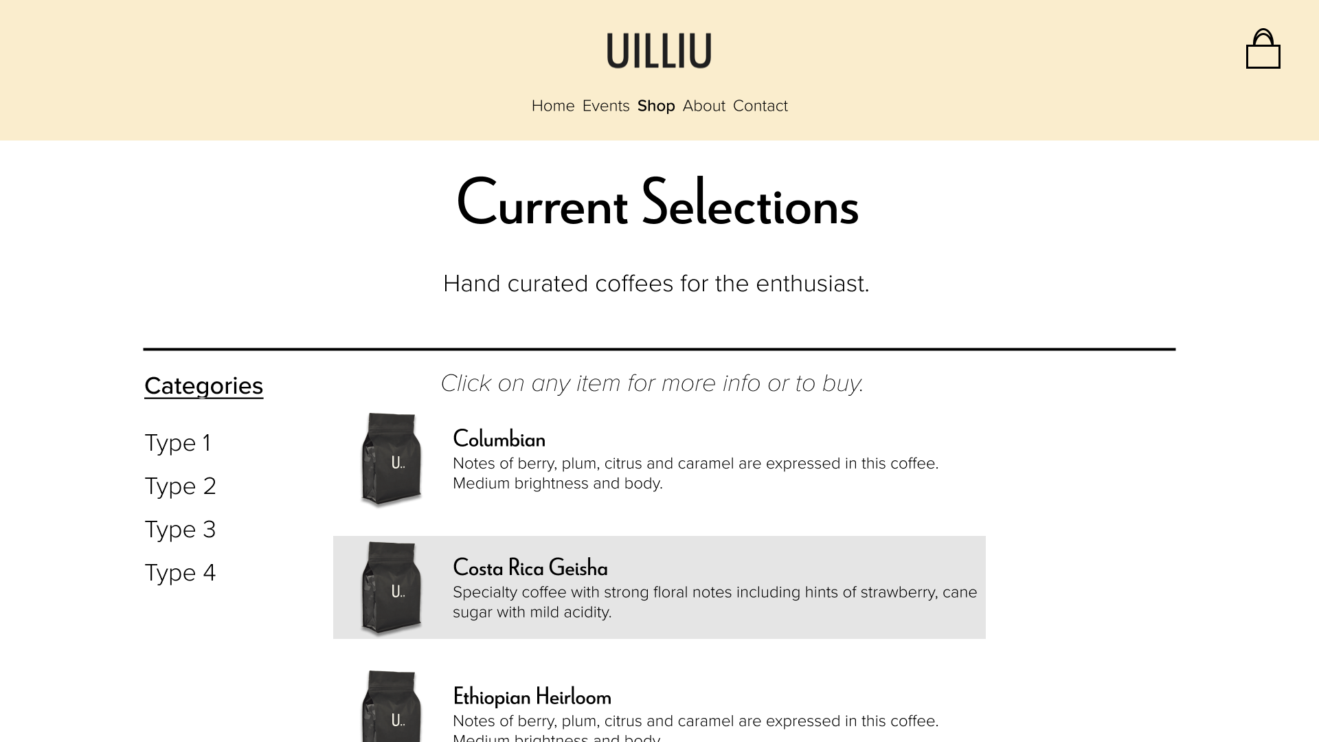
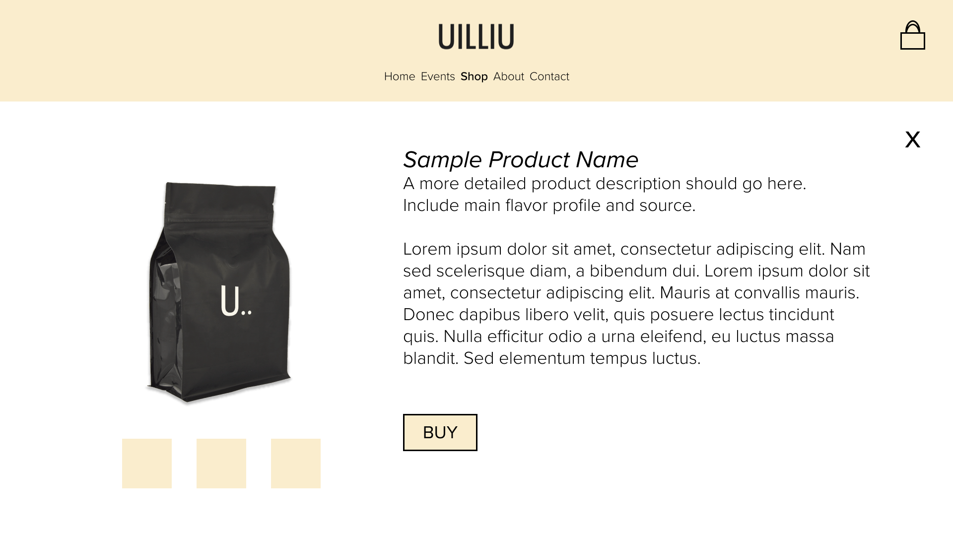
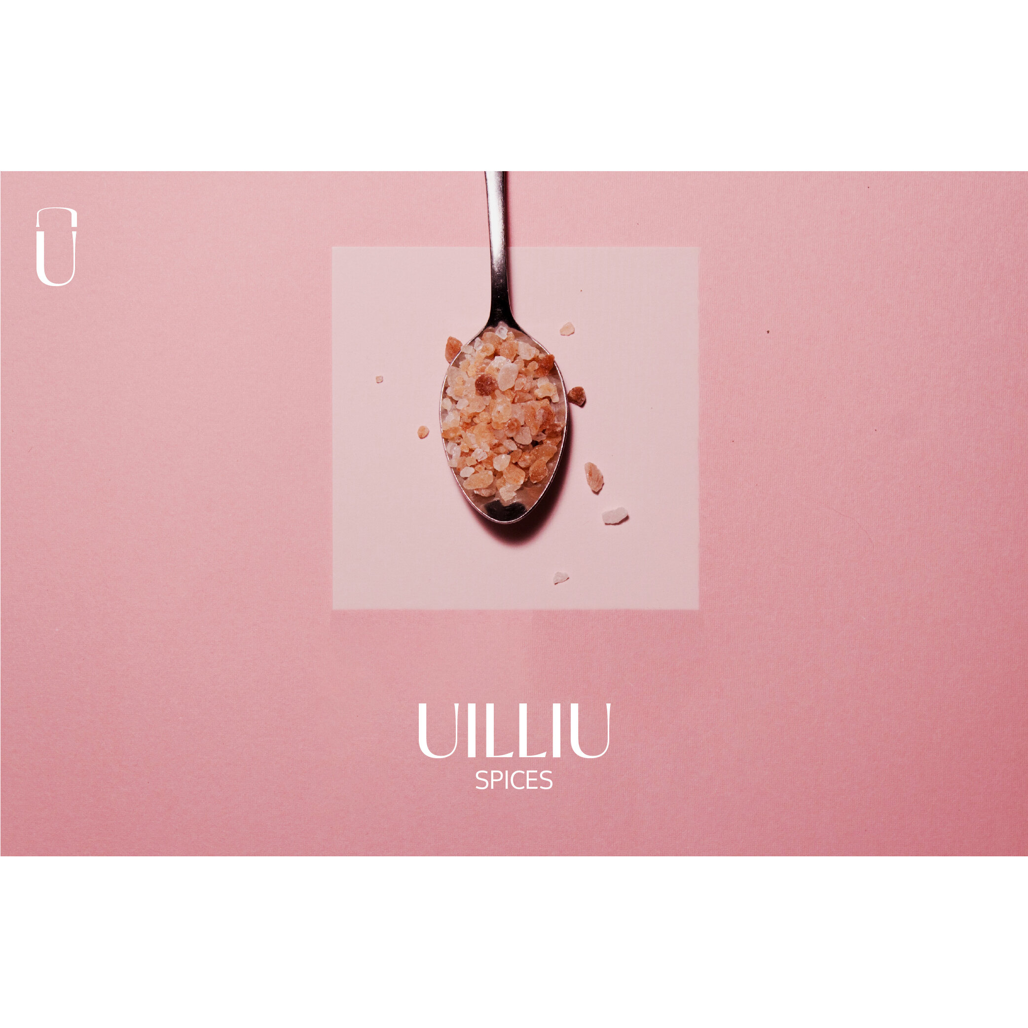
The package design seen at the top takes the same approach as the logo design. Perfume and other beauty products were taken as inspiration, along with more modern food brands. To ensure that people see the containers as food first and foremost, we made the spice front and center. It is also easier to use in the kitchen—not having to read the label.
A Second Act

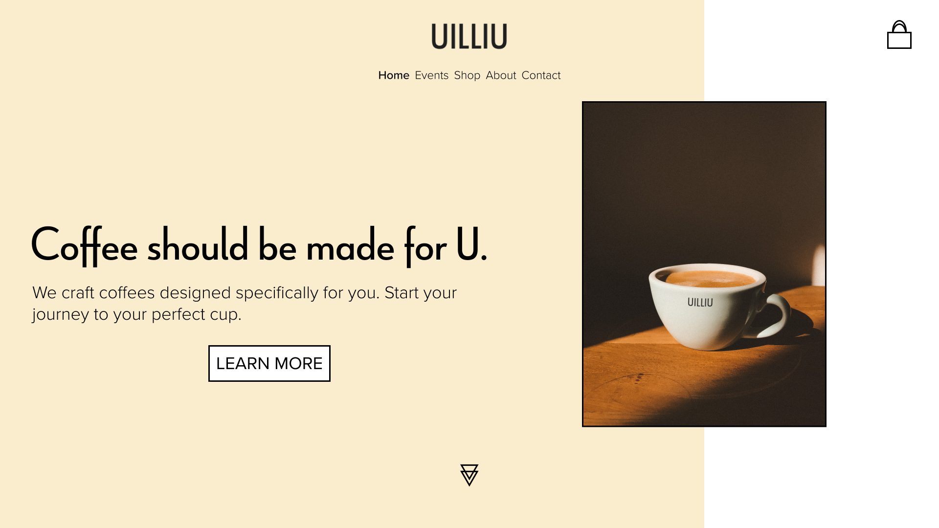
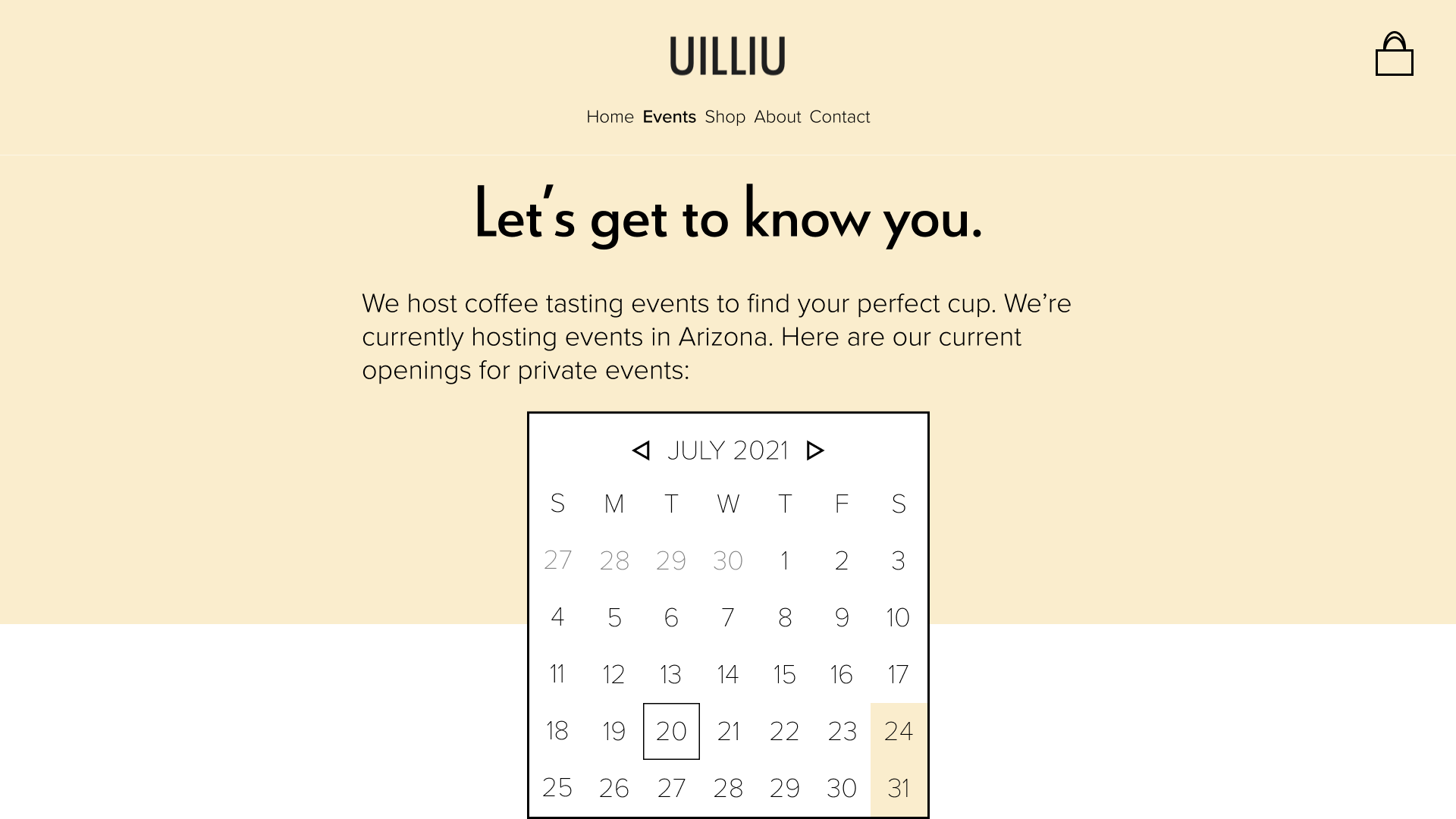
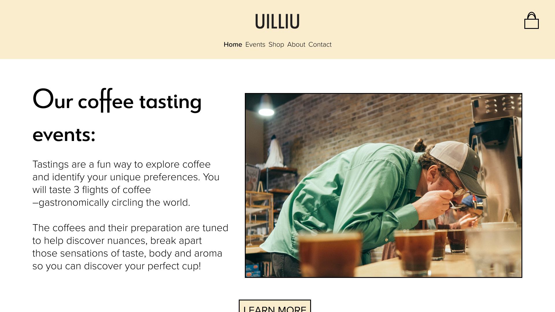
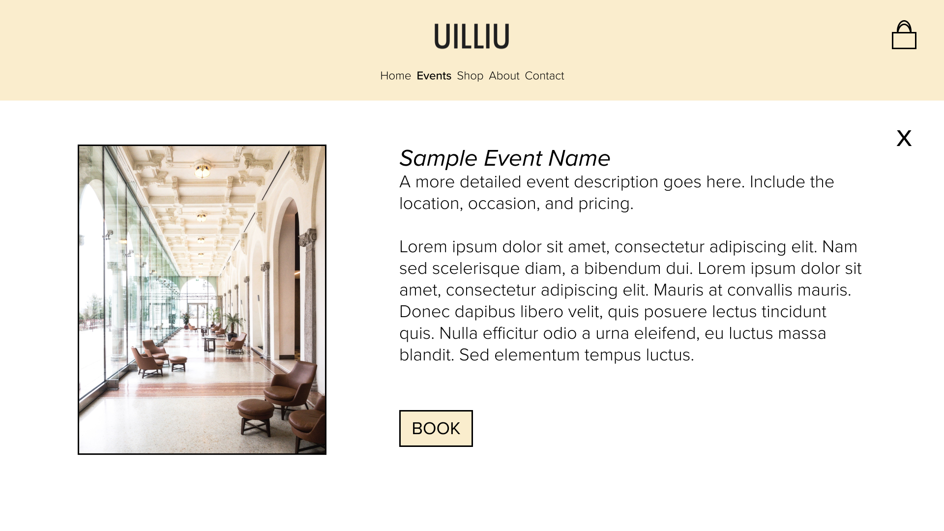
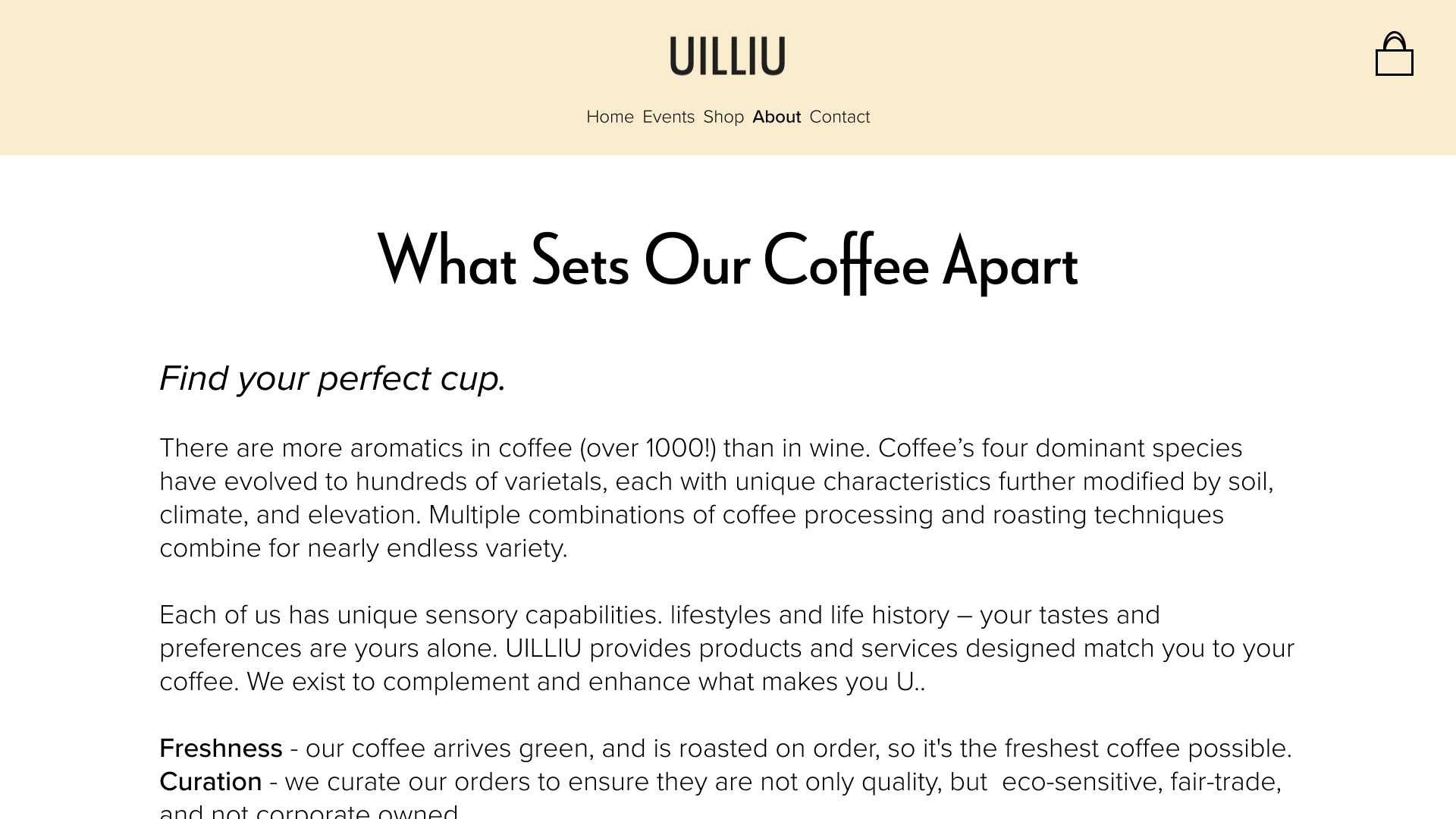
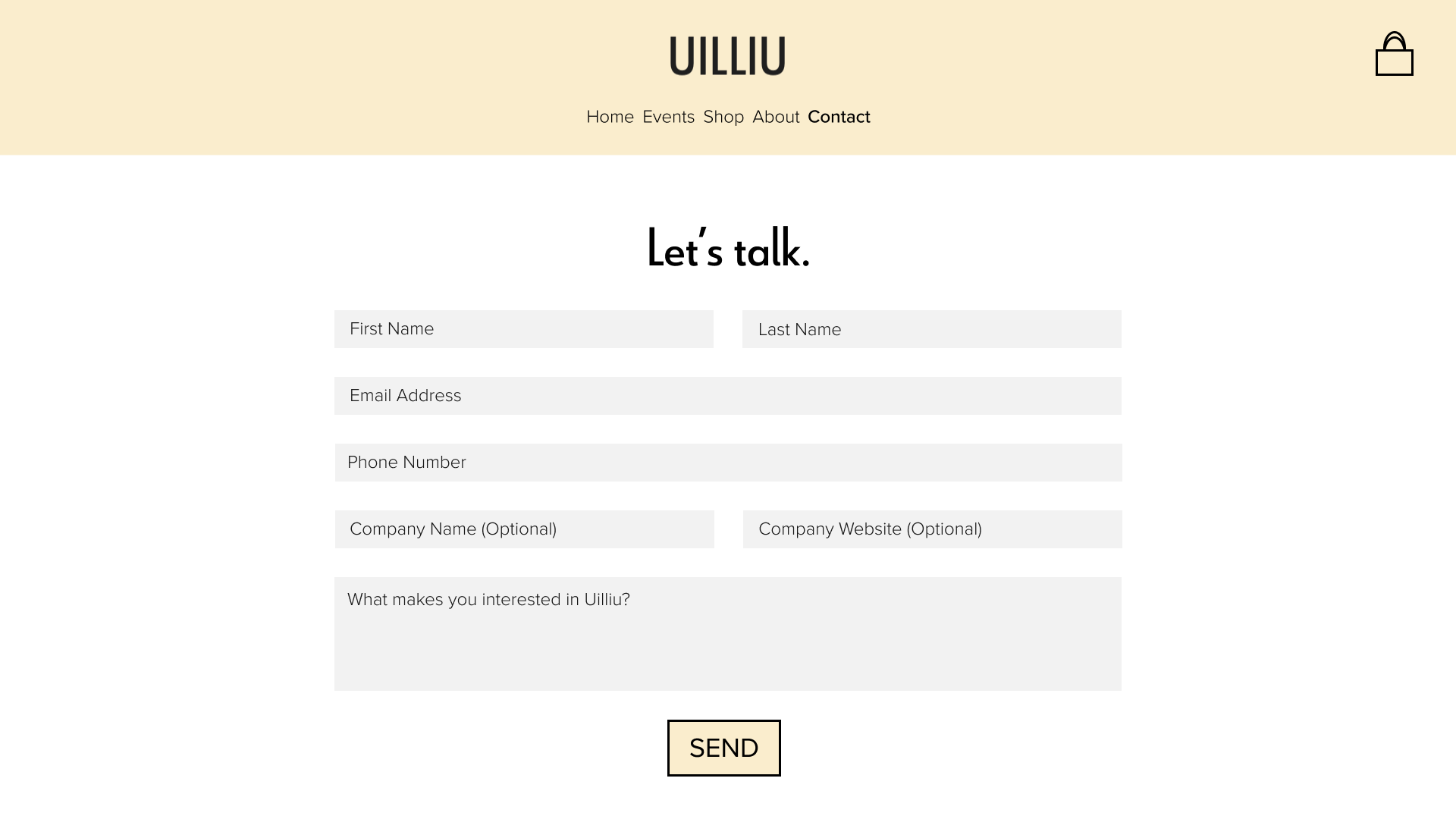
Later on, our client reached back out to us. They had shifted business models and had wanted to get into curated coffee experiences.
The new challenge was to adopt a coffee identity that was welcoming, fit within the local coffee space, and moved their brand forward. We adopted a new color, added new icons, and created a layout that was built upon the brand collateral we had given them previously.