Nimbus
A Late-night, Modern, American restaurant.
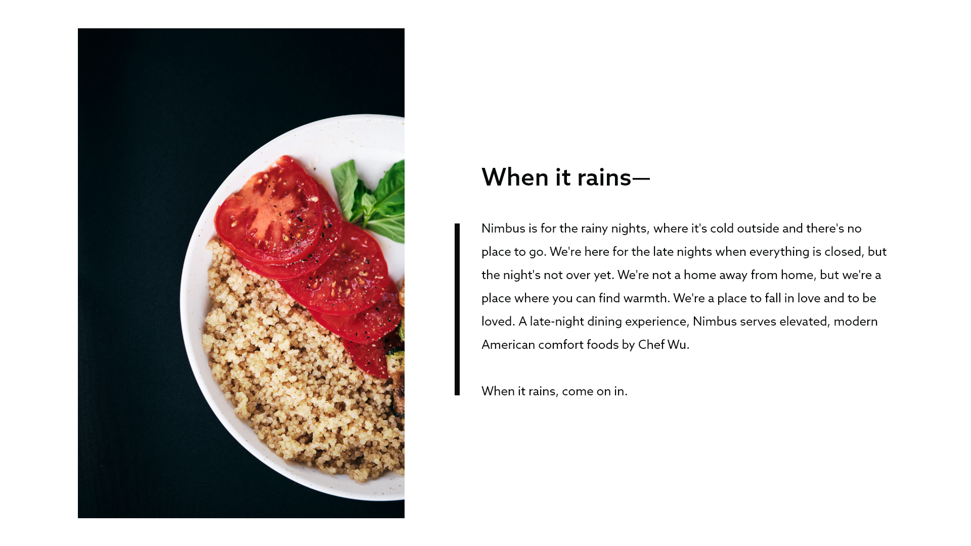
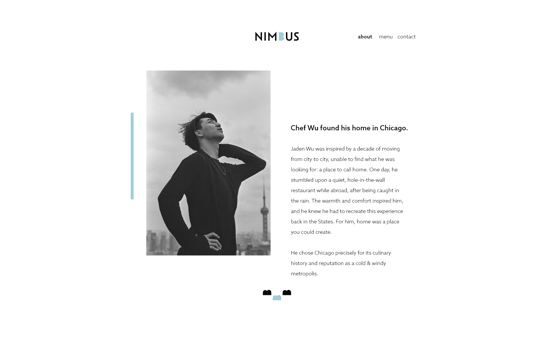
Nimbus is a modern, upscale restaurant concept. It’s where you go when it’s rainy and cold outside. It’s for the late nights when everything is closed, but the night's not over yet. The goal here was to strike a balance between being lively while remaining sophisticated.
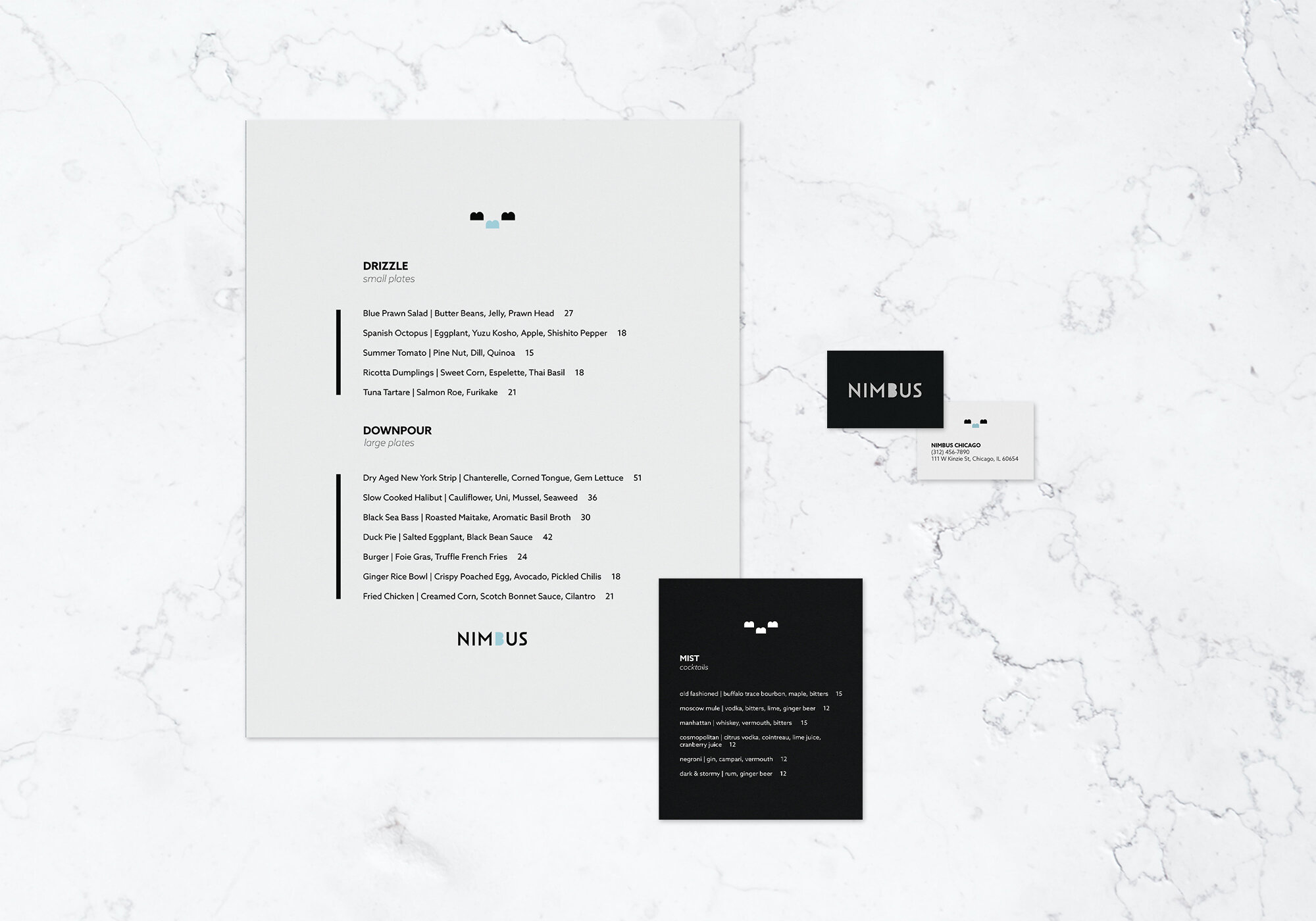
Moreover, the brand had to be moody (after all, it’s late night dining) while retaining a cheerful/neutral mood. This is reflected in the balancing act of Nimbus’ brand elements: business cards and menus that are black and white, the name of the brand (a rain cloud) with a playful blue cloud, the tongue-in-cheek menu sections (“drizzle” for appetizers, “downpour” for entrées).
Few upscale restaurants exist that cater to late-night dining, so we thought this concept would be interesting to explore.


Logo Design
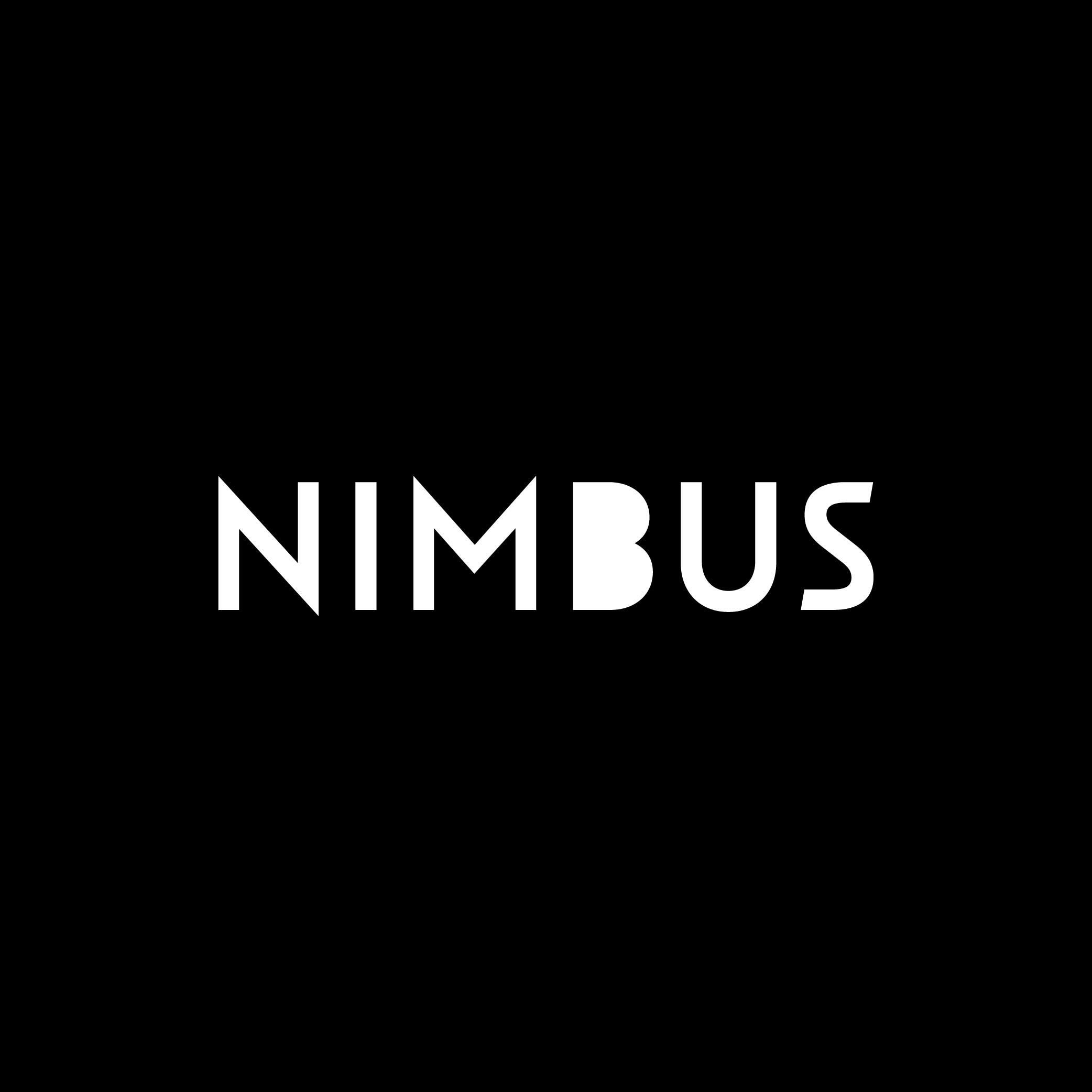
Modern, upscale dining establishments often use sans-serif typefaces, and that was precisely our challenge. How do you show modernity and trendiness without playing into cliché? We avoided commonly used typefaces like Helvetica, but we stayed in the modern restaurant genre by using a sans-serif, art deco-esque typeface.
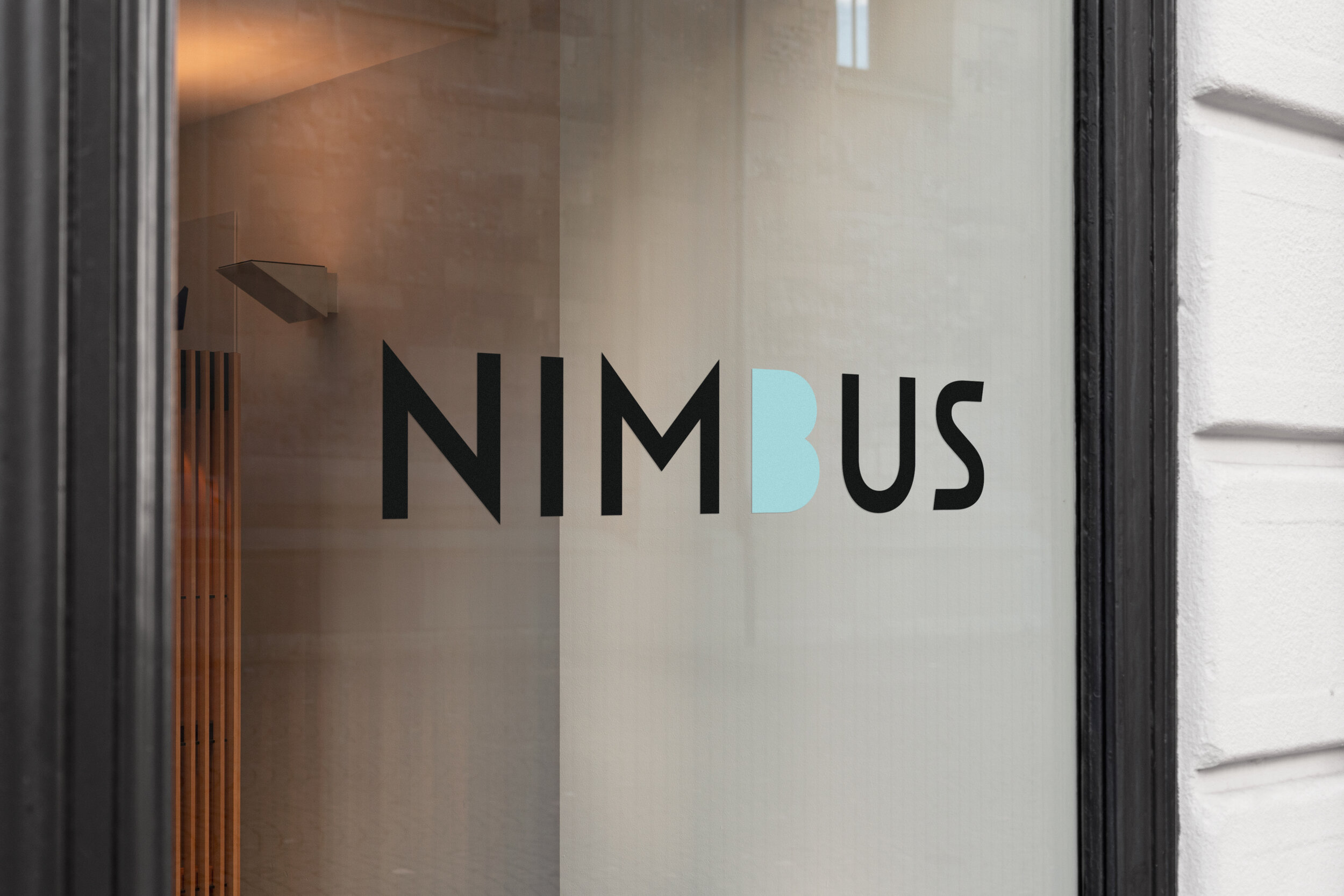
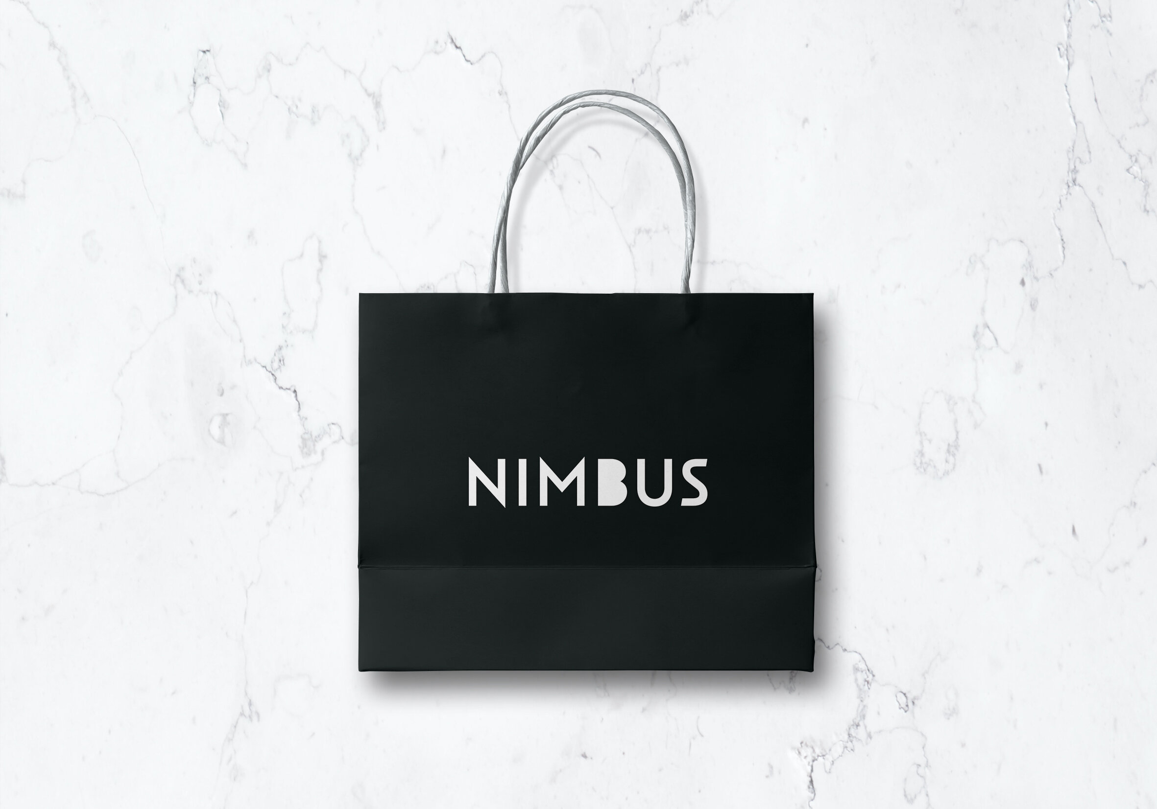
Another challenge—and this goes for all of our logos—is that the logo must still be distinctive in black and white. The letter “B” was altered to have a cloud-like appearance, and the result is used as rain clouds and gives a distinctive shape to the logo. This adds to the brand’s playfulness without being silly. Similarly, the resulting logotype and logomark are distinctive while not looking out of place.

Photography
A restaurant’s photography is what catches the attention of hungry, potential customers. When they’re scrolling through online reviews and restaurant websites, the photography they see has to look as if it would taste good.
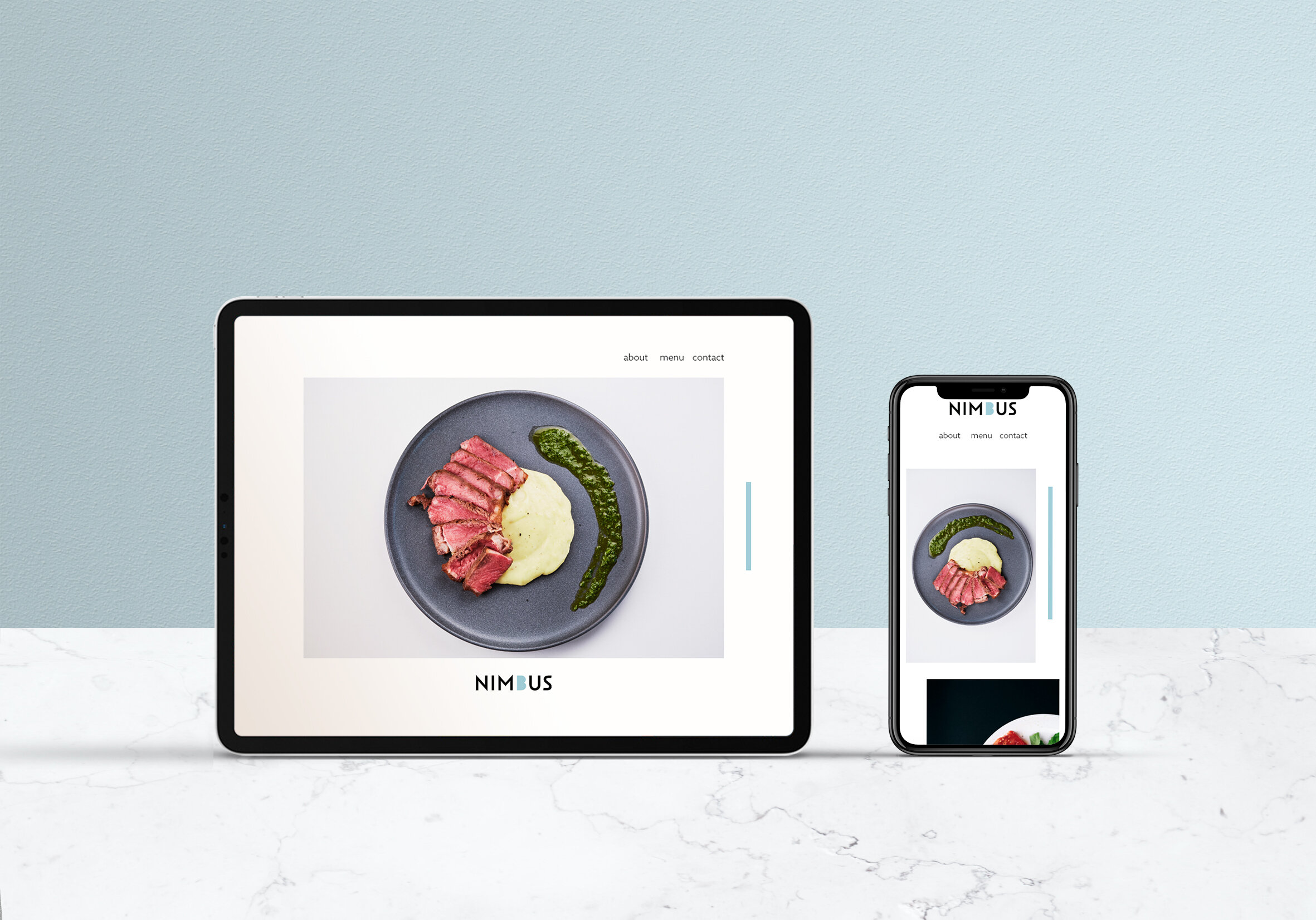
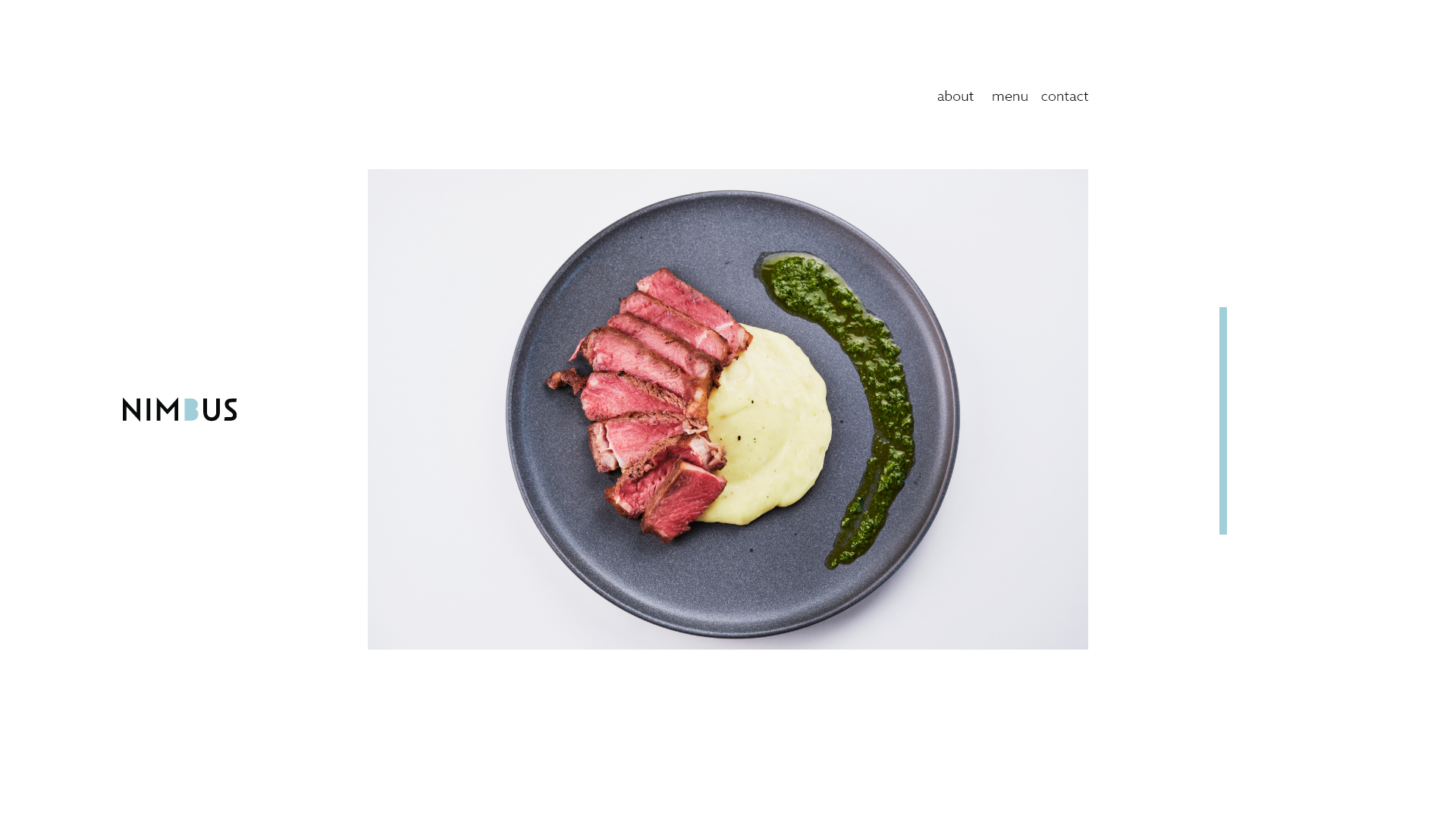
We chose a photography style that is colorful and bright while staying true-to-life. No one wants to eat green eggs and ham, and everyone gets disappointed by food that looks better in commercials than in real life. Food is laid out on plates that match or compliment minimalist backgrounds. This minimalist photography keeps the emphasis on the food and has a modern feel. Furthermore, it stands out on social media feeds, and it allows for placement of the logotype too.
Food photos were shot using more neutral focal lengths, such as 35mm and 50mm to retain a true-to-life feel.
Brand Voice
Nimbus’ voice centers on being heartfelt. It ties together the coziness expected out of an establishment you’d go to on a rainy night and the playfulness that prevents the brand from being gloomy. The tone is both romantic and friendly all at once. In other words, it’s inviting. Rain is used throughout the brand in a way that’s both metaphorical and literal. This is used to establish the vibe and setting of the restaurant.
Nevertheless, Nimbus is an upscale dining brand, and so the tone isn’t overtly silly either. The metaphors and humor extend to tongue-in-cheek descriptions, but there are no punchlines here. Menu item descriptions are succinct.
Oftentimes, menus are too wordy, and this can get in the way of the dining experience, where diners are focused on reading instead of each other or the atmosphere. This to-the-point verbiage is also seen on the website design for similar reasons.