
Introhm

Wearable tech challenging the status quo.
Introhm (pronounced in-trome) is a tech startup based in Tempe, Arizona that develops smart wearables for the fitness realm. In creating their brand identity, there was an equal need for style, class, and brashness to help the startup establish reputability while standing out.
The challenge in developing any new brand, especially for a startup, is that they’re essentially a blank slate. The voice, mission, and story must be made from scratch—there’s no history to pull from.
Logo Design
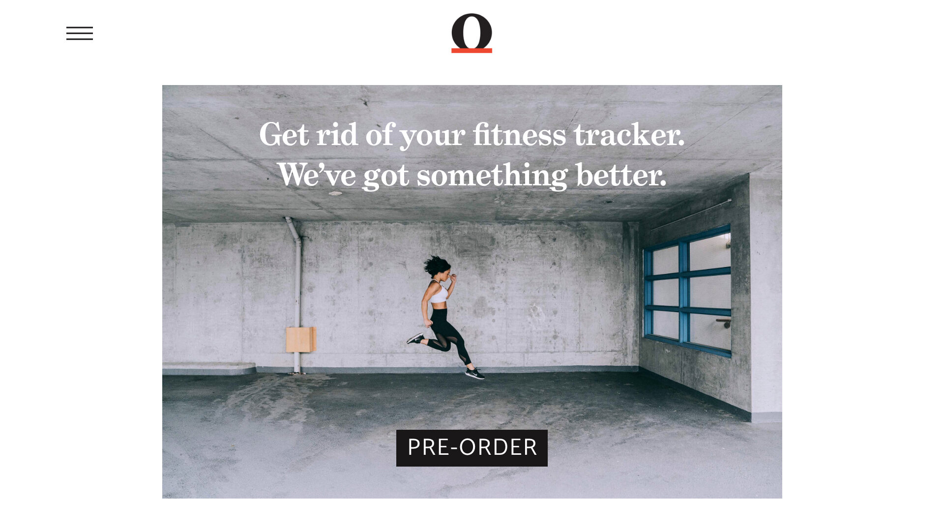
The Introhm brand was designed with the goal to stand out first and foremost. The design began with a serif typeface instead of the usual sans-serif typeface. To stay in the fitness genre, a more bold font was chosen, along with the tongue-in-cheek period.
The omega symbol Ω was chosen as the logomark since it’s half of the company name, stands out as a symbol, and relates to the company’s product. The bright red color was chosen to help the brand stand out amongst other tech companies that commonly go with the color blue and to fit with the voice of the brand.

Brand Voice
To stand out from other tech and fitness brands, Introhm went with a more brash and irreverent voice on most of the copy, such as on the website’s hero image and main sections. However, this was toned down and a more honest voice is used wherever the content “gets real” or more personal, such as in blogs or on the founders’ bios. While standing out was important, Introhm still had to be relatable to people.

Photography
The photography had to convey athleticism and brashness while having enough space to put text on it. This resulted in using and taking photos that were more minimal in composition and using a lot of black & white photography. Color photos had a colder tone and few colors overall. Models in photos must be in some form of active movement.
